June 26, 2026
June 26, 2026
AI Product Ads That Do Not Look Generic
Make AI product ads feel specific, on-brand, and worth testing, without the same tired AI look.
Make AI product ads feel specific, on-brand, and worth testing, without the same tired AI look.
Learn how to make AI product ads that feel real, match your brand, and give creative teams a simple review system.
The fix for generic AI product ads is simple: give the AI stronger direction, then review every output with clear rules. If your ads look bland, the problem is usually not the model, it is the brief, the references, and the way you choose winners.
This guide shows a practical way to make AI product ads that feel specific, fit your brand, and are easier to test. It is written from Kubflow’s creative workflow point of view, so you can turn the same steps into a repeatable system.
What makes AI product ads look generic
Most generic AI ads fail for the same few reasons:
The prompt is too open, so the model fills in the blanks with safe, bland choices.
The ad has no clear customer, so it speaks to everyone and nobody.
The visual style changes from one output to the next, so the brand feels messy.
The team approves “good enough” instead of checking for real product truth.
In plain words, the ad looks like AI because it was asked to be “creative” without enough limits. Good ads need a point of view. They should feel like they came from your brand, for one real shopper, in one real moment.
Use AI product ads with a clear creative job
Before you generate anything, decide what job the ad has to do. This keeps the output from drifting into random art.
Pick one of these jobs:
Show the product clearly, for shoppers who already know the item.
Make the benefit obvious, for shoppers who need a quick reason to care.
Feel like real UGC, for social ads that should look casual and human.
Build a launch mood, for teaser ads that sell curiosity.
For example, a skincare brand should not ask for “a premium beauty ad.” That is too wide. A better brief is: “Show a 30-second morning routine for oily skin, shot in bright window light, with one close-up of the texture and one line about shine control.”
That kind of direction gives the model boundaries. Boundaries make the ad feel less generic.
How to brief AI product ads so they feel specific
A strong brief has five parts. Keep it short, but do not skip any part.
Product truth, what the item actually is and what it does.
Target person, who is most likely to buy it.
One pain point, the simple problem the ad should answer.
One visual world, where and how the ad should feel.
One proof point, the detail that makes it believable.
Example brief for a bottle opener brand:
Product truth: compact opener for home bars.
Target person: people who host friends on weekends.
Pain point: cheap openers bend or slip.
Visual world: warm kitchen, evening, relaxed hosting.
Proof point: metal grip, easy one-hand use, close-up of smooth opening.
If you want the model to work faster, feed it a real product photo, brand colors, and a short style note. If you want to build this as a reusable system, Kubflow is a good place to store the rules and rerun them across different ad angles.
AI product ads need review rules, not just prompts
Prompts alone will not save you. A good review checklist is what stops the AI from producing the same safe look over and over.
Use these review rules on every output:
Does it look like our brand? Colors, mood, and tone should match.
Does the product feel real? Shape, size, and use should make sense.
Is there one clear idea? If the ad tries to say three things, simplify it.
Would a customer believe this? Remove odd props, fake poses, or strange hands and faces.
Does it feel different from the last ad? Keep the brand style, but change the angle, hook, or scene.
Here is a simple rule that helps a lot: keep the brand consistent, but vary the hook. That means the colors and tone can stay familiar, while the story changes.
For example, a candle brand might test:
“Gift for a friend” angle
“Calm night routine” angle
“Room refresh” angle
Same product. Same brand feel. Different reason to care.
Example inputs and outputs for stronger AI product ads
Use the same product, but change the creative direction. That is how you avoid sameness.
Input | Good output | Why it works |
|---|---|---|
Generic “make it premium” prompt | Warm light, one hand holding the product, close-up on texture, simple text about the main benefit | Specific scene and one job |
“Show lifestyle” prompt | A real morning routine in a small bathroom, with the product used naturally | Feels lived-in, not staged |
“Make it viral” prompt | Short UGC-style hook, one problem, one fast demo, one clear payoff | Built for attention and clarity |
Notice the pattern: each better output has a clear setting, a clear action, and one message. That is what makes the ad feel made, not generated.
A simple workflow you can repeat every week
Here is the workflow we would use for ecommerce teams that need volume without losing taste:
Pick one product and one buyer.
Write three angles, not ten.
For each angle, define the scene, the hook, and the proof.
Generate a small set of visuals or clips.
Review with the checklist above.
Keep the best version, then make one small change and test again.
This is where a visual AI workflow builder helps. In Kubflow, you can connect the steps so the team does not start from scratch every time. That makes it easier to keep the same brand rules while changing the creative idea.
When the process is repeatable, creative teams spend less time fixing weird outputs and more time improving the ad itself.
Common mistakes that make AI ads feel fake
Too many effects, glitter, glow, and motion tricks can hide the product.
Too much perfection, real people and real products usually look a little imperfect.
Too many words, the ad should not need a paragraph to explain itself.
No clear use case, if the product is not being used, the ad feels empty.
One prompt for every product, each item needs its own angle and visual world.
If you notice your ads all look the same, do not blame the model first. Look at the brief, the scene, and the review step. That is usually where sameness starts.
Checklist before you launch AI product ads
One product, one customer, one message.
One clear visual scene.
Real product details are visible.
The ad feels like your brand, not a random template.
The hook is different from the last test.
The output is easy to understand in a few seconds.
If you can check all six boxes, the ad is much more likely to feel like a real creative test, not AI noise.
For teams that want to turn this into a weekly system, see how Kubflow helps you build repeatable AI creative workflows without losing brand control: build your workflow in Kubflow.
Final thought
AI product ads do not have to look generic. The secret is not bigger prompts, it is better direction and better review. Give the model a clear job, keep the brand rules tight, and change the angle on purpose.
If you want to make that process easier to repeat, see Kubflow pricing and build the same creative system for every new ad test.
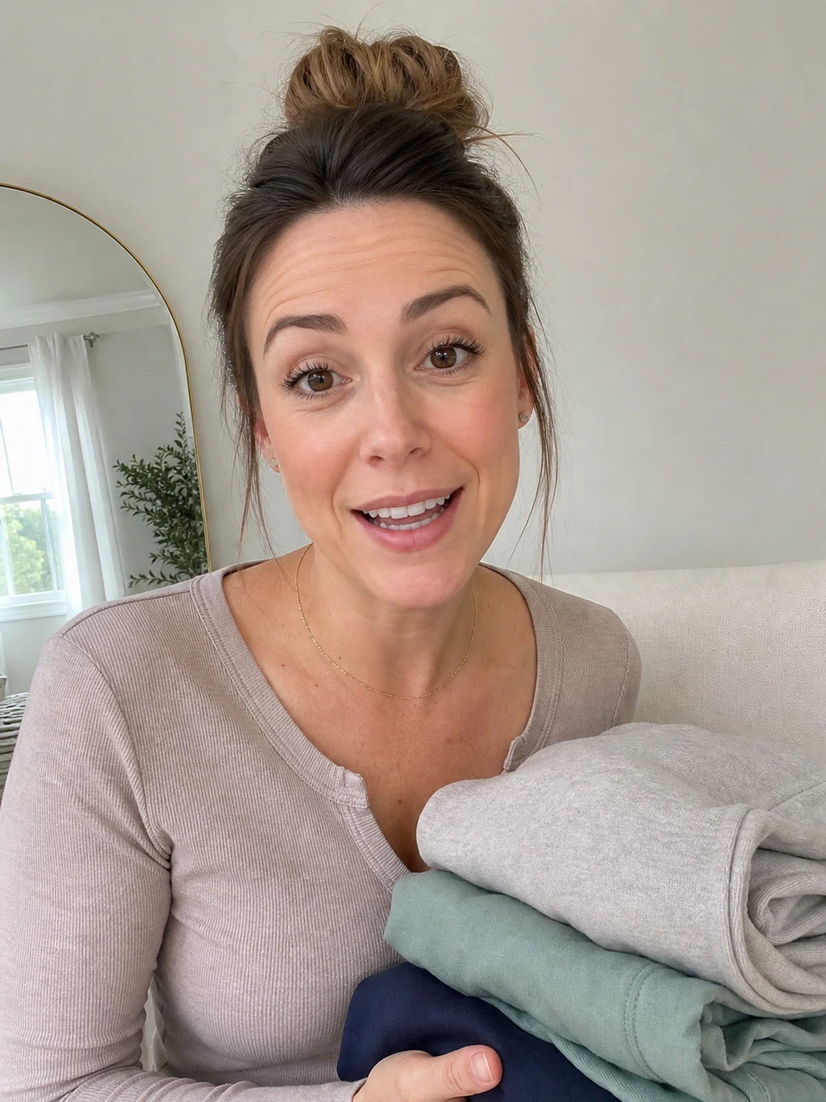


Learn how to make AI product ads that feel real, match your brand, and give creative teams a simple review system.
The fix for generic AI product ads is simple: give the AI stronger direction, then review every output with clear rules. If your ads look bland, the problem is usually not the model, it is the brief, the references, and the way you choose winners.
This guide shows a practical way to make AI product ads that feel specific, fit your brand, and are easier to test. It is written from Kubflow’s creative workflow point of view, so you can turn the same steps into a repeatable system.
What makes AI product ads look generic
Most generic AI ads fail for the same few reasons:
The prompt is too open, so the model fills in the blanks with safe, bland choices.
The ad has no clear customer, so it speaks to everyone and nobody.
The visual style changes from one output to the next, so the brand feels messy.
The team approves “good enough” instead of checking for real product truth.
In plain words, the ad looks like AI because it was asked to be “creative” without enough limits. Good ads need a point of view. They should feel like they came from your brand, for one real shopper, in one real moment.
Use AI product ads with a clear creative job
Before you generate anything, decide what job the ad has to do. This keeps the output from drifting into random art.
Pick one of these jobs:
Show the product clearly, for shoppers who already know the item.
Make the benefit obvious, for shoppers who need a quick reason to care.
Feel like real UGC, for social ads that should look casual and human.
Build a launch mood, for teaser ads that sell curiosity.
For example, a skincare brand should not ask for “a premium beauty ad.” That is too wide. A better brief is: “Show a 30-second morning routine for oily skin, shot in bright window light, with one close-up of the texture and one line about shine control.”
That kind of direction gives the model boundaries. Boundaries make the ad feel less generic.
How to brief AI product ads so they feel specific
A strong brief has five parts. Keep it short, but do not skip any part.
Product truth, what the item actually is and what it does.
Target person, who is most likely to buy it.
One pain point, the simple problem the ad should answer.
One visual world, where and how the ad should feel.
One proof point, the detail that makes it believable.
Example brief for a bottle opener brand:
Product truth: compact opener for home bars.
Target person: people who host friends on weekends.
Pain point: cheap openers bend or slip.
Visual world: warm kitchen, evening, relaxed hosting.
Proof point: metal grip, easy one-hand use, close-up of smooth opening.
If you want the model to work faster, feed it a real product photo, brand colors, and a short style note. If you want to build this as a reusable system, Kubflow is a good place to store the rules and rerun them across different ad angles.
AI product ads need review rules, not just prompts
Prompts alone will not save you. A good review checklist is what stops the AI from producing the same safe look over and over.
Use these review rules on every output:
Does it look like our brand? Colors, mood, and tone should match.
Does the product feel real? Shape, size, and use should make sense.
Is there one clear idea? If the ad tries to say three things, simplify it.
Would a customer believe this? Remove odd props, fake poses, or strange hands and faces.
Does it feel different from the last ad? Keep the brand style, but change the angle, hook, or scene.
Here is a simple rule that helps a lot: keep the brand consistent, but vary the hook. That means the colors and tone can stay familiar, while the story changes.
For example, a candle brand might test:
“Gift for a friend” angle
“Calm night routine” angle
“Room refresh” angle
Same product. Same brand feel. Different reason to care.
Example inputs and outputs for stronger AI product ads
Use the same product, but change the creative direction. That is how you avoid sameness.
Input | Good output | Why it works |
|---|---|---|
Generic “make it premium” prompt | Warm light, one hand holding the product, close-up on texture, simple text about the main benefit | Specific scene and one job |
“Show lifestyle” prompt | A real morning routine in a small bathroom, with the product used naturally | Feels lived-in, not staged |
“Make it viral” prompt | Short UGC-style hook, one problem, one fast demo, one clear payoff | Built for attention and clarity |
Notice the pattern: each better output has a clear setting, a clear action, and one message. That is what makes the ad feel made, not generated.
A simple workflow you can repeat every week
Here is the workflow we would use for ecommerce teams that need volume without losing taste:
Pick one product and one buyer.
Write three angles, not ten.
For each angle, define the scene, the hook, and the proof.
Generate a small set of visuals or clips.
Review with the checklist above.
Keep the best version, then make one small change and test again.
This is where a visual AI workflow builder helps. In Kubflow, you can connect the steps so the team does not start from scratch every time. That makes it easier to keep the same brand rules while changing the creative idea.
When the process is repeatable, creative teams spend less time fixing weird outputs and more time improving the ad itself.
Common mistakes that make AI ads feel fake
Too many effects, glitter, glow, and motion tricks can hide the product.
Too much perfection, real people and real products usually look a little imperfect.
Too many words, the ad should not need a paragraph to explain itself.
No clear use case, if the product is not being used, the ad feels empty.
One prompt for every product, each item needs its own angle and visual world.
If you notice your ads all look the same, do not blame the model first. Look at the brief, the scene, and the review step. That is usually where sameness starts.
Checklist before you launch AI product ads
One product, one customer, one message.
One clear visual scene.
Real product details are visible.
The ad feels like your brand, not a random template.
The hook is different from the last test.
The output is easy to understand in a few seconds.
If you can check all six boxes, the ad is much more likely to feel like a real creative test, not AI noise.
For teams that want to turn this into a weekly system, see how Kubflow helps you build repeatable AI creative workflows without losing brand control: build your workflow in Kubflow.
Final thought
AI product ads do not have to look generic. The secret is not bigger prompts, it is better direction and better review. Give the model a clear job, keep the brand rules tight, and change the angle on purpose.
If you want to make that process easier to repeat, see Kubflow pricing and build the same creative system for every new ad test.